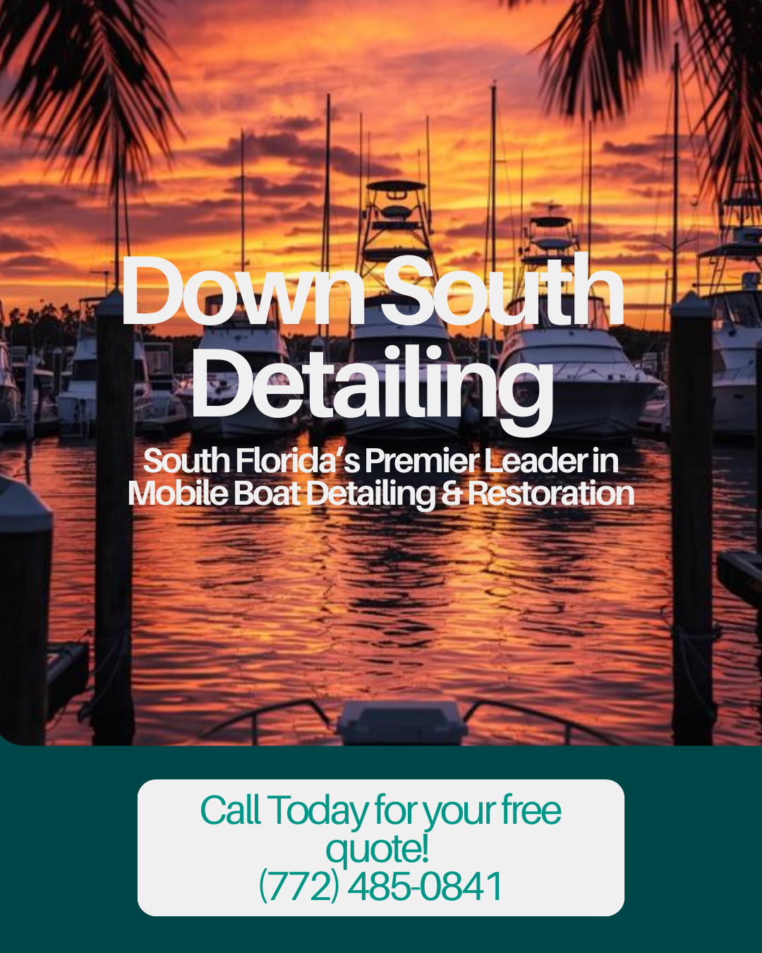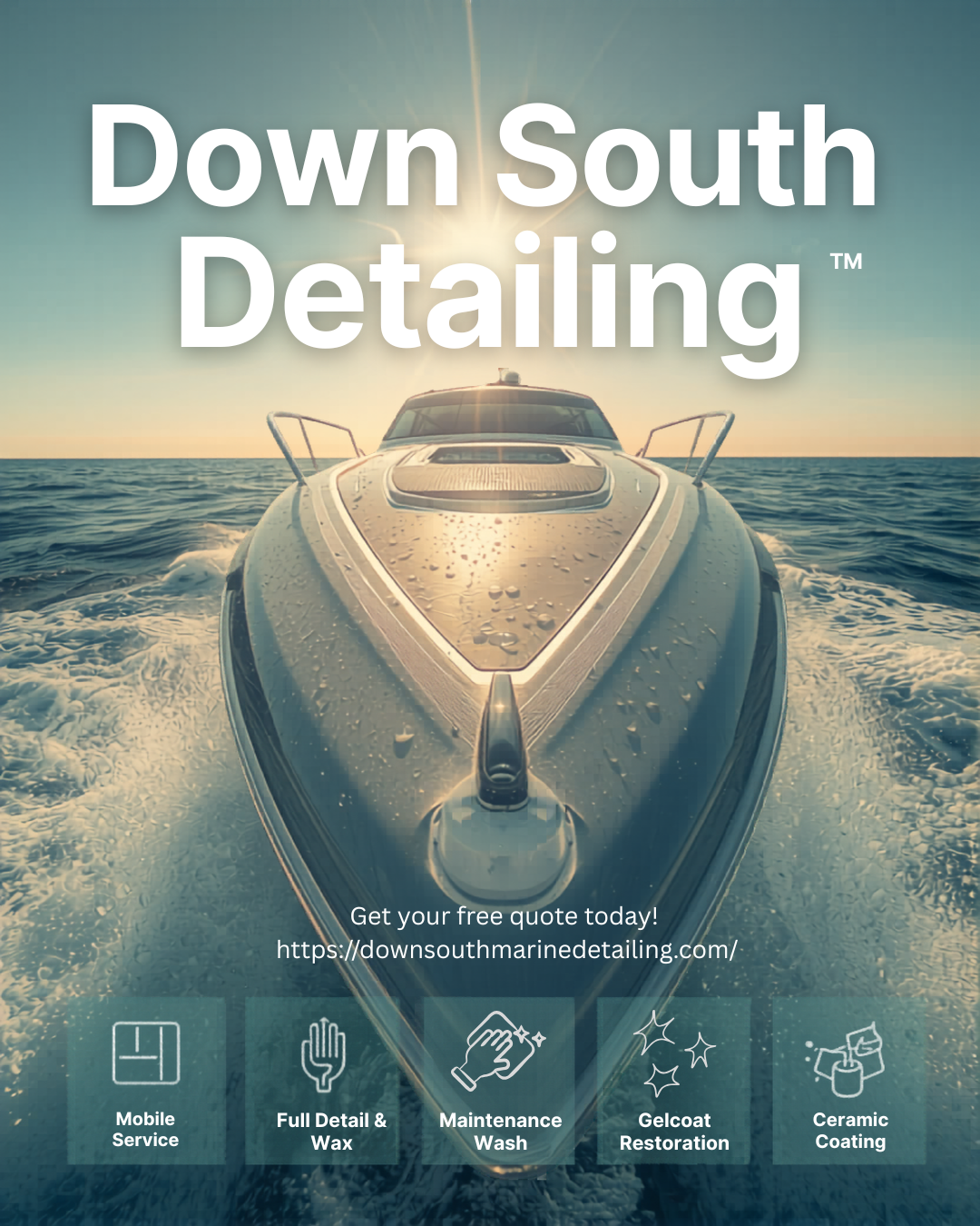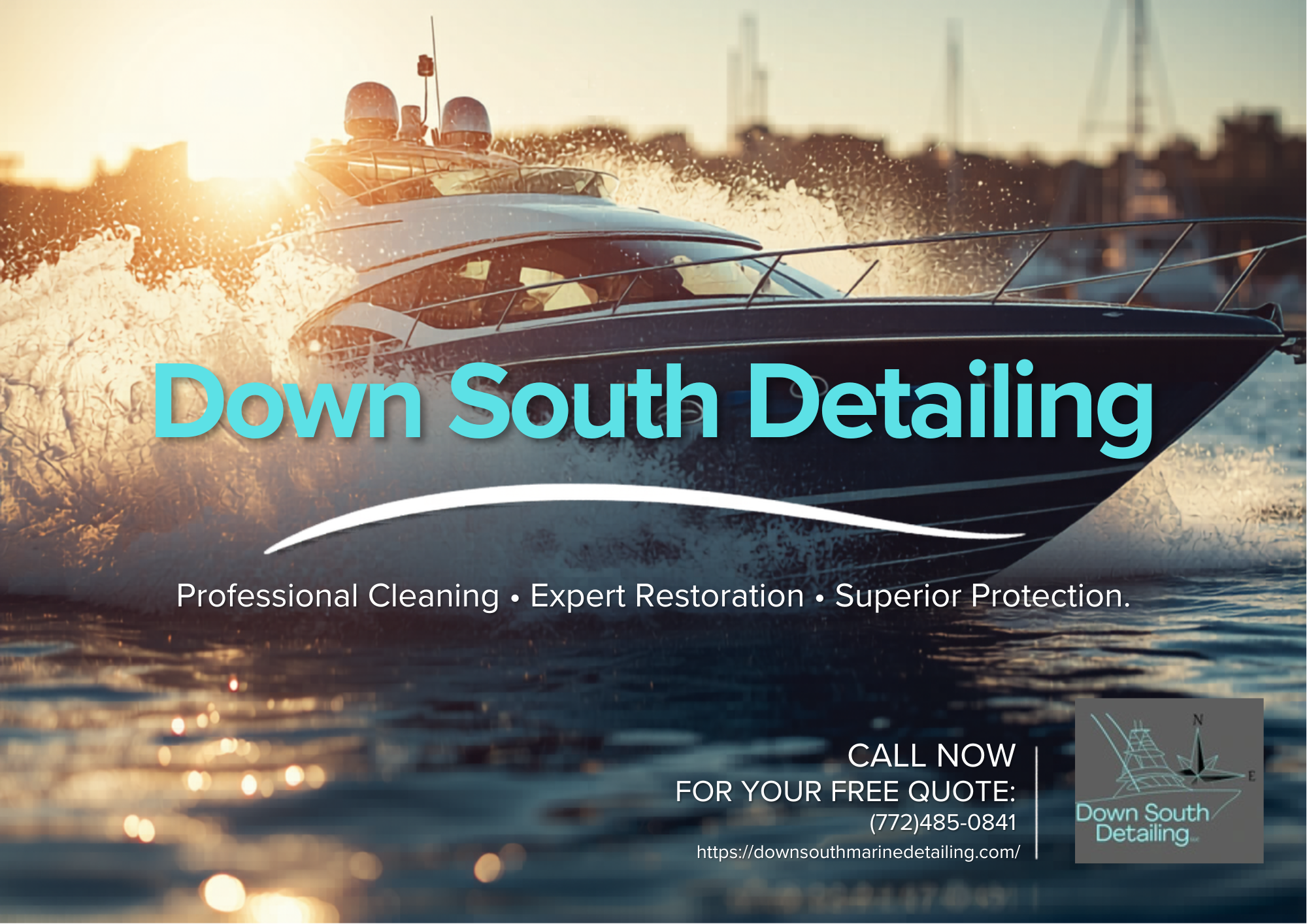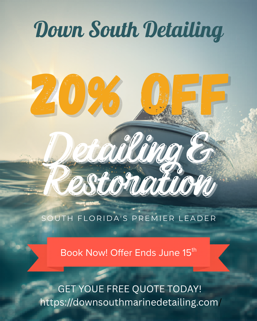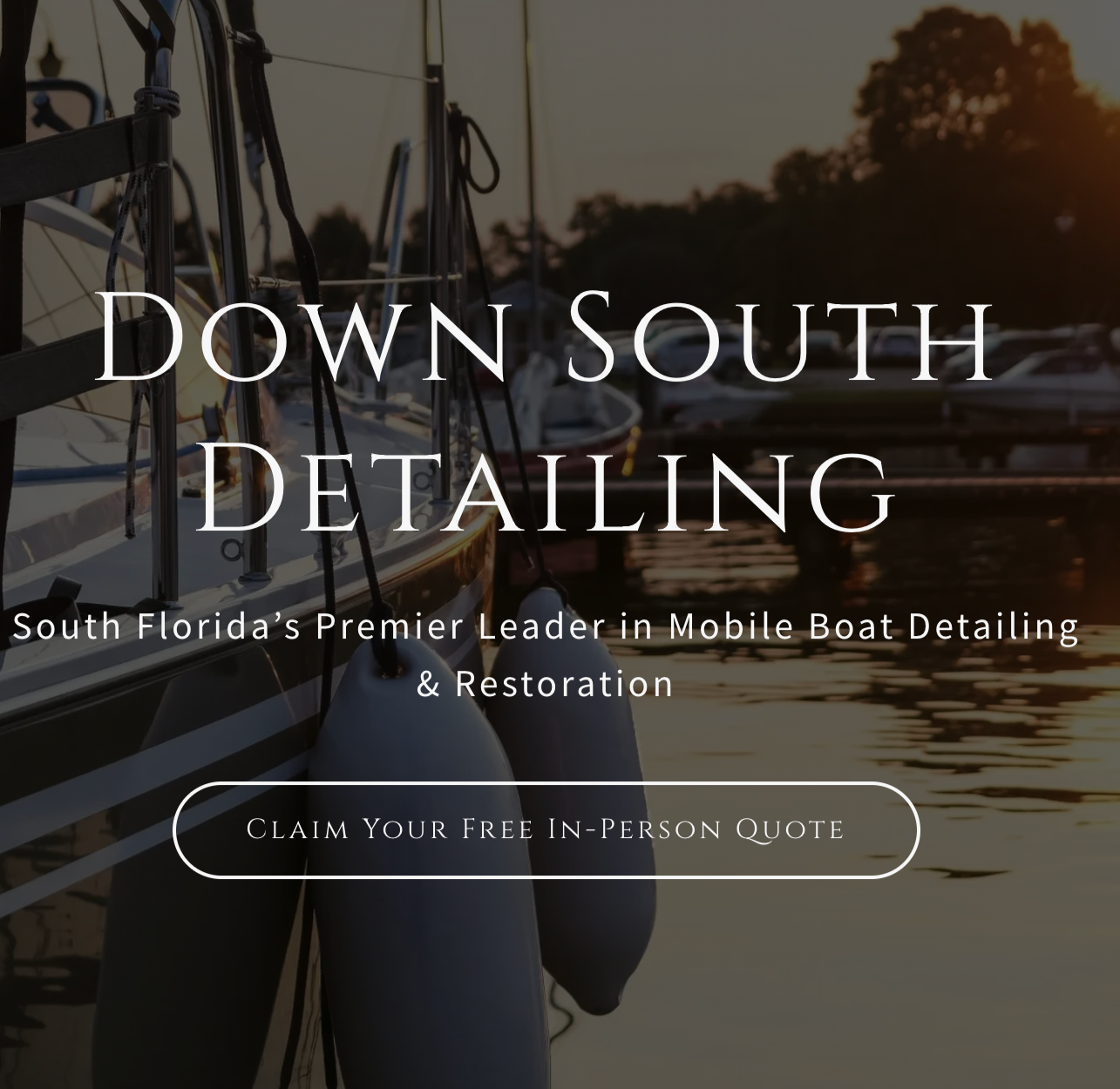
Down South Detailing
Project Summary: Branding / Marketing Campaigns / Full Web Redesign
Brand Positing Summary: is a mobile boat detailing service in South Florida offering maintenance washes, full detail wash & wax, ceramic coating, gelcoat restoration, teak cleaning, and sanding services. The website serves as the primary source for service information, customer testimonials, and quote requests.
Planning
Planning & Execution
For this phase, the focus was on refining the brand direction while keeping what already worked—especially the existing logo—so the brand could feel more elevated without losing recognition.
Design Direction
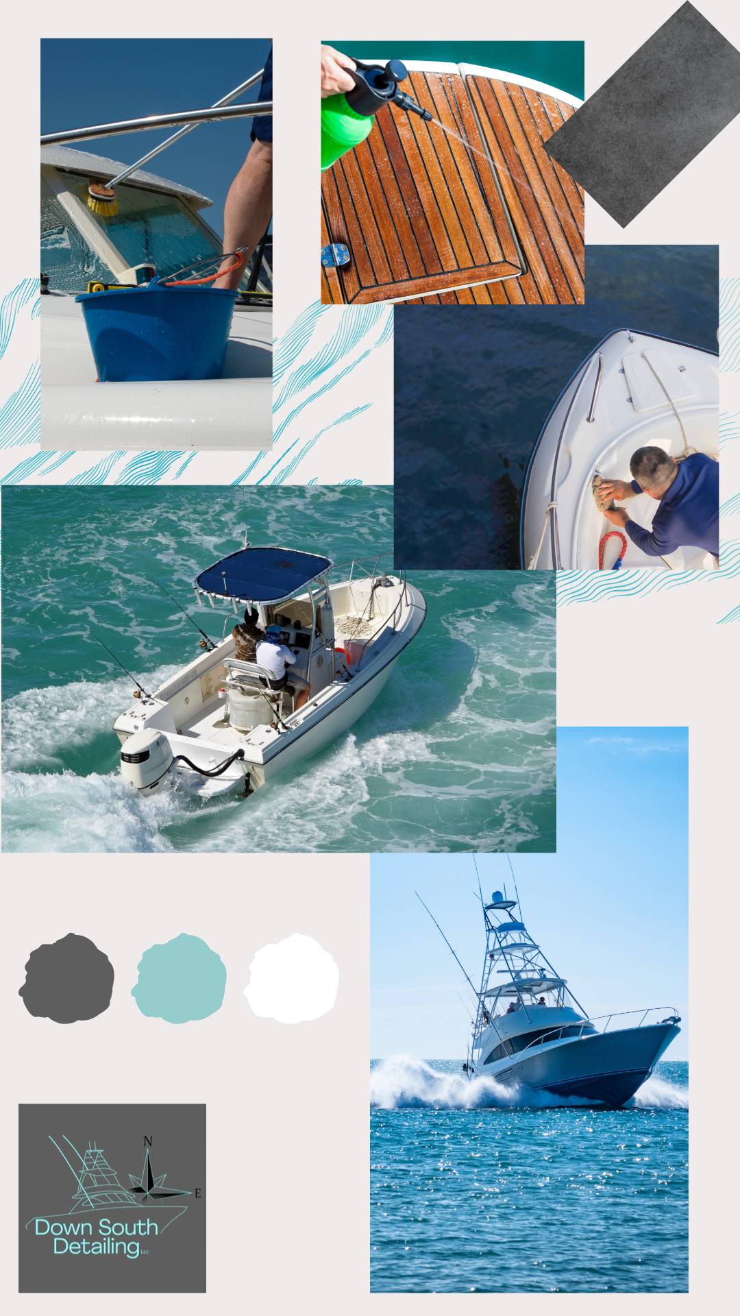
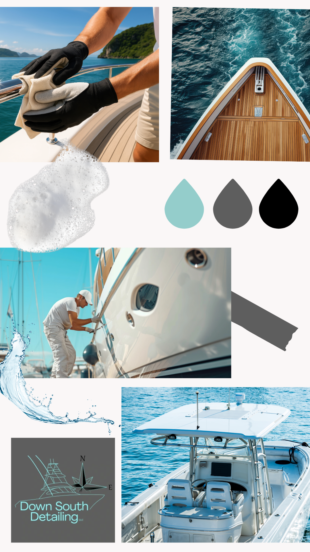
The overall concept centers around a nautical, high-end aesthetic that feels clean, professional, and trustworthy. Since the target audience includes yacht owners and premium clients, every design decision leans toward simplicity and polish rather than overly decorative elements.
Design Attributes
Color Palette: Blue, white, and grey to reflect water, cleanliness, and professionalism
Typography: A strong nautical-style font for headings paired with a clean sans-serif for balance and readability
Visual Style: Minimal, refined layouts with subtle marine elements (water textures, coastal tones)
Brand Feel: Trustworthy, high-end, detail-oriented
Stylistic Approach
The design avoids anything overly busy or overly themed. Instead, it uses:
Clean spacing and strong alignment
Clear visual hierarchy to guide attention
High-quality imagery that reflects luxury and precision
Consistent branding across all touchpoints
Execution Plan
Refine and apply brand elements across marketing materials
Develop reusable templates for email and social campaigns
Create a consistent visual system for future scalability
Ensure all designs are responsive, clean, and easy to navigate
Goal
To create a cohesive and elevated visual identity that builds trust, appeals to high-end clients, and positions Down South Marine Detailing as a premium, reliable service.
Execution
In this phase, the focus was on bringing the refined brand direction to life through clean, high-end designs that feel consistent and ready for real-world use.
Execution
I applied the approved visual direction across all assets, making sure everything felt cohesive and aligned with the brand’s professional, nautical identity. The existing logo was seamlessly integrated, while the blue, white, and grey palette helped reinforce a clean, trustworthy look.
Typography and layout were handled with intention—using strong hierarchy, simple structure, and plenty of spacing to keep everything polished and easy to navigate. Each design was created with the target audience in mind, ensuring it felt elevated and appropriate for high-end yacht clients.
Quality & Consistency
Before delivery, I reviewed all assets to ensure:
Consistent use of colors, fonts, and layout
Clean, professional presentation across all materials
Readability and responsiveness across devices
Strong, clear calls-to-action
Delivery
Final files were organized and delivered in a way that’s easy for the client to use and build on, including:
Marketing campaign assets (email and social)
Reusable templates for future use
Organized design files with clear structure
Outcome
A polished, cohesive set of designs that elevate the brand while maintaining its original identity—positioning Down South Marine Detailing as a professional, trustworthy service for high-end clients.
Mood Boards
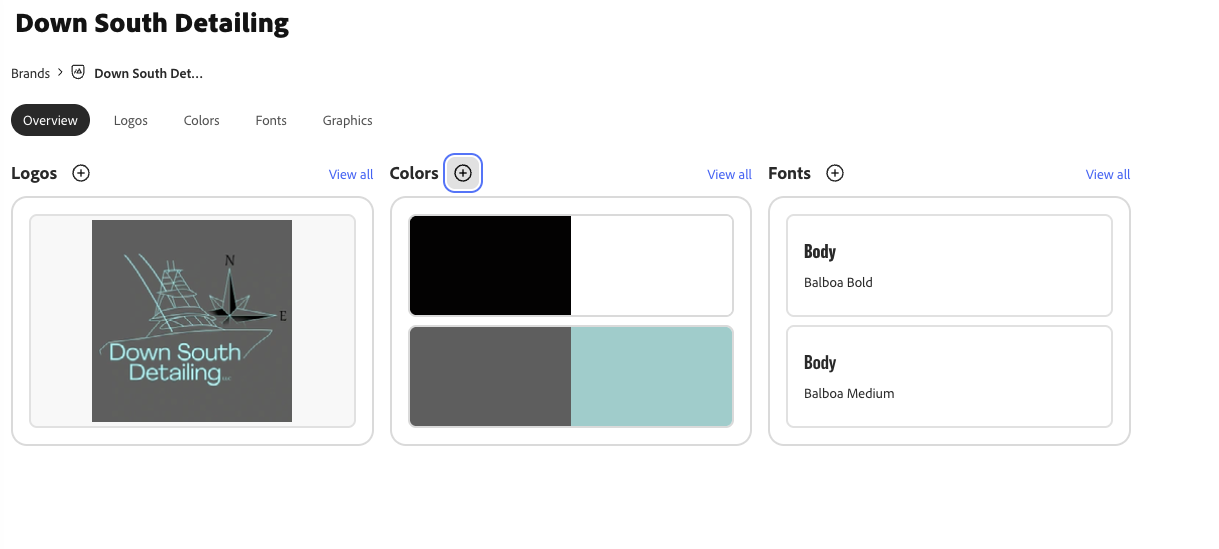
Brand Kit
Presented Slide Deck
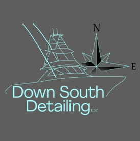
Client Logo
(Existing logo)
Full Web Redesign
Role: UX Designer (audit & redesign)
Platform: Web (Responsive Desktop + Mobile)
Tools: Figma, UX Research, Accessibility Testing
The Problem
Down South Marine Detailing offers premium boat detailing services in South Florida — ceramic coating, gelcoat restoration, full wash and wax — but their website wasn't doing the business justice. Services were buried in dense text blocks, the mobile experience was difficult to navigate, and the primary call to action — requesting a free quote — was nearly invisible.
For a service business, the website is the first handshake with a potential client. This one wasn't landing.
Who I Was Designing For:
The primary users were boat owners in South Florida researching detailing services, often on mobile, often comparing multiple providers at once. They needed three things quickly: to understand what's offered, to see proof the work is good, and to contact someone without friction.
None of those three things were easy on the existing site.
What I Found:
Auditing the existing experience surfaced five clear issues:
Weak visual hierarchy. Services were listed as plain text in repeating blocks with no visual distinction — nothing guided the eye or helped users scan quickly.
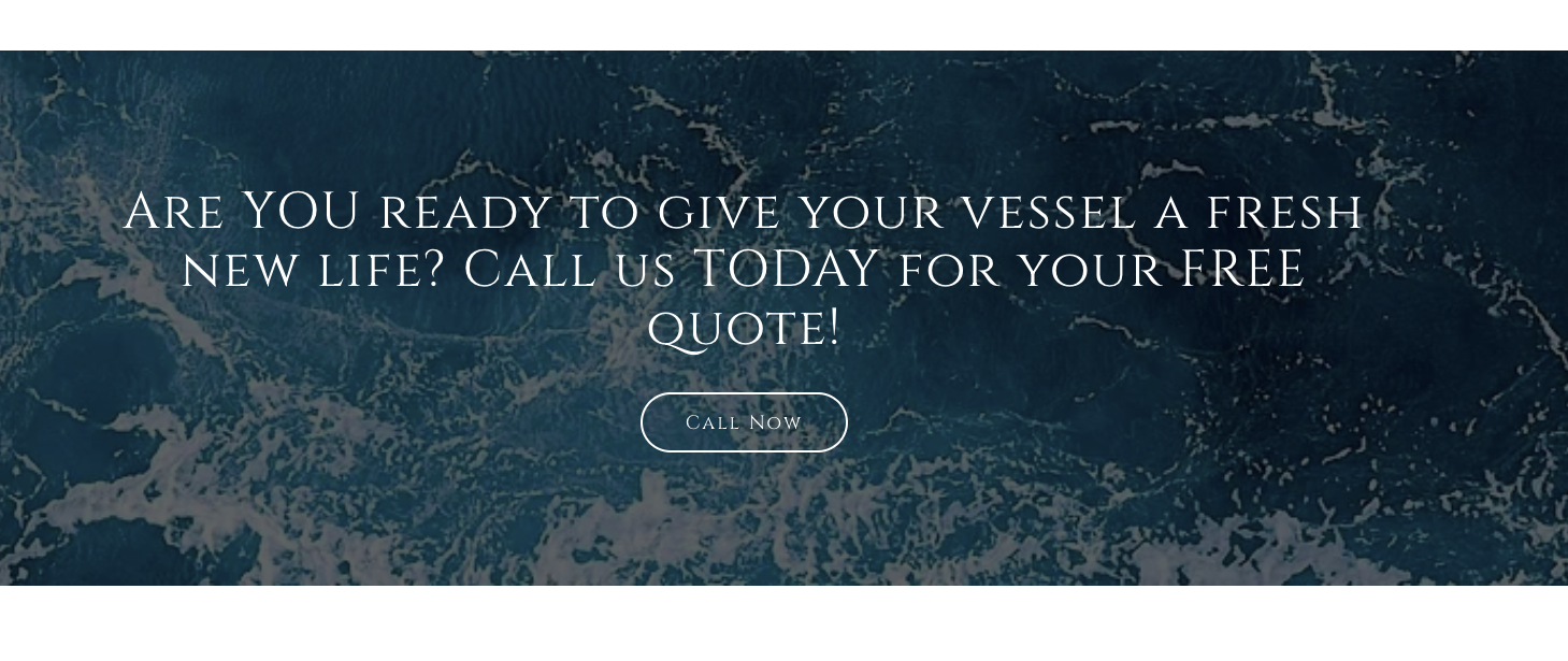
A buried CTA. The "Free Quote" form sat at the bottom of the page with no lead-up, no urgency, and no secondary entry points throughout the content.
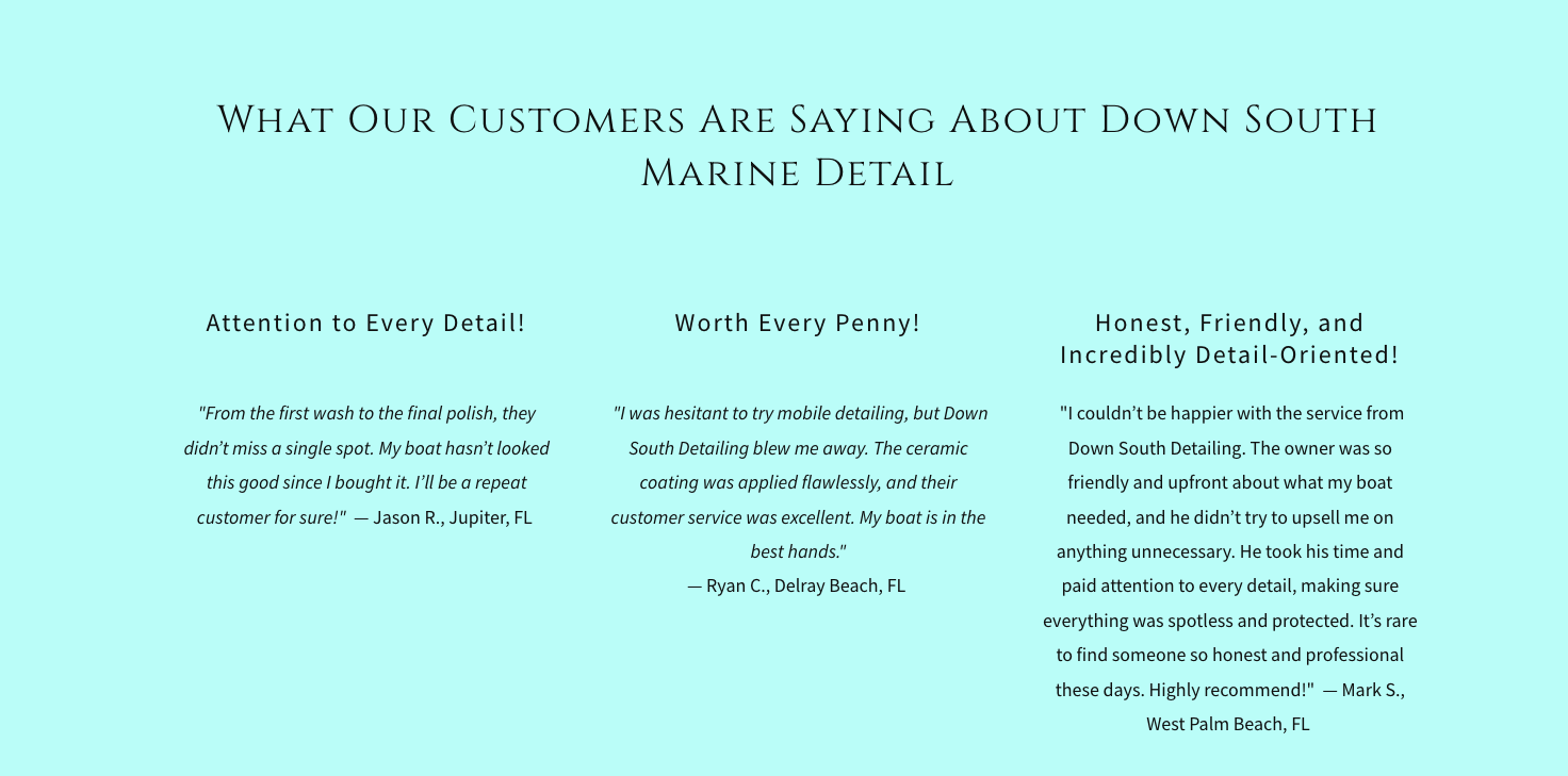
Thin social proof. Before/after photos existed but lacked context, labeling, or storytelling — the kind of visual evidence that actually builds trust with a new customer.
Poor mobile experience. The dense layout collapsed badly on smaller screens, making an already difficult experience worse on the device most users were arriving on.
Inconsistent branding. The visual design was functional but lacked the polish and cohesion that a premium service brand needs to earn trust at a glance.
What I Did:
I restructured the page around a single goal: get a qualified lead to request a quote with as little friction as possible.
That meant rethinking the service presentation first — moving from a wall of text to a card-based layout with icons, short descriptions, and clear visual separation. Scanning the page became fast and intuitive.
For the before/after section, I designed an interactive slider with contextual labels (Before: Oxidation — After: Restoration) so the transformation told its own story rather than relying on the user to interpret bare images.
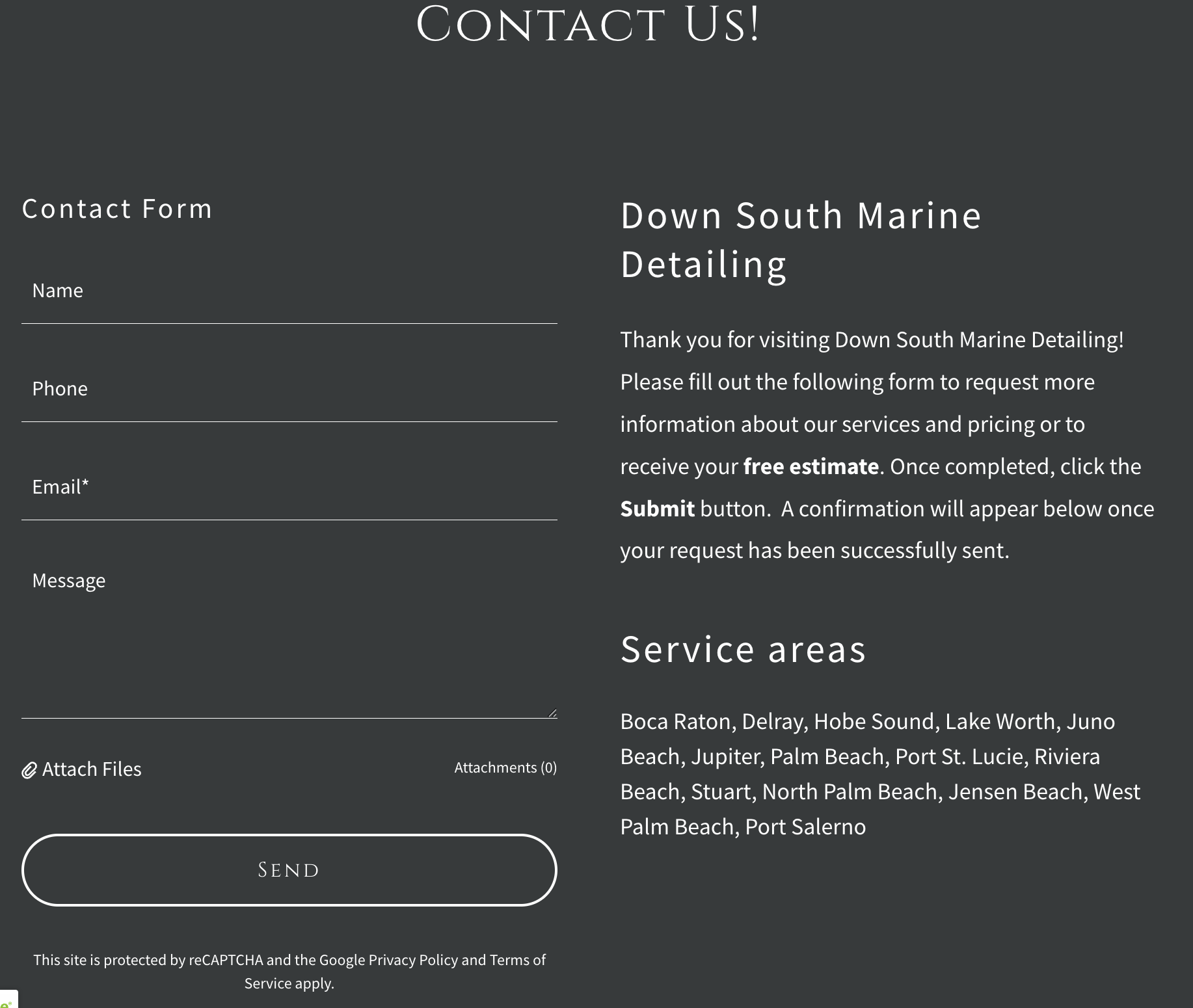
The contact flow got a full overhaul — a persistent header CTA, a secondary prompt following the services section, and a simplified multi-step form with a progress indicator to reduce drop-off.
On mobile, I introduced sticky CTA buttons, accordion-style service details to reduce scroll fatigue, and touch targets that met accessibility standards throughout.
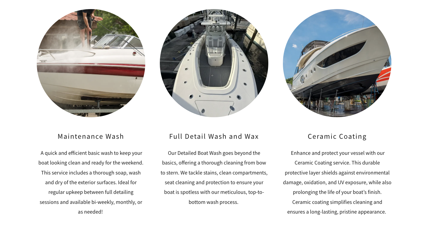
- Before (example):
Maintenance Wash

Full Detail Wash and Wax

Ceramic Coating
- After (visual suggestion):
🛥️ Maintenance Wash — Quick upkeep between detailed services
✨ Full Detail — Top-to-bottom cleaning & protection
🛡️ Ceramic Coating — UV & environmental protection
Design Strategies
By implementing this redesign:
Higher lead conversion rate from the homepage
Better mobile engagement and reduced bounce rate
Improved perceived professionalism and trust
Increased clarity of service offerings and benefit
Results & Reflection
The redesign positions Down South Marine Detailing as the premium, trustworthy service their clientele expects — with a clearer path from first visit to booked appointment.
If I were to revisit this project, I'd run moderated usability testing on the multi-step quote form specifically. Form drop-off is notoriously hard to predict without real user data, and that's the moment the whole experience is building toward.