Driftwood Outdoor Gear
Project Summary: Branding / Marketing Campaigns
Brand Positioning Statement: Driftwood Outdoor Gear was building its brand from the ground up — they had a clear sense of who they were (eco-conscious adventurers, rugged but considered) but no visual system to carry that identity. They needed brand design and marketing campaign assets that could tell their story consistently across email, social, and web.
Driftwood Outdoor Gear
My Role
End-to-end brand design. I led the project from discovery and creative direction through to production-ready templates and final delivery, working directly with the client throughout.
The Process
I started with deep discovery: understanding the target audience (outdoor-oriented adults 18–45 who care about sustainability), studying competitor and inspiration references (Patagonia, REI, Timberland), and developing a brand positioning statement that would anchor every visual decision.
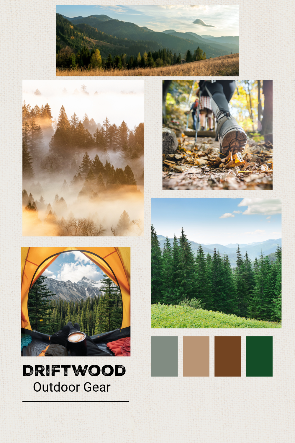
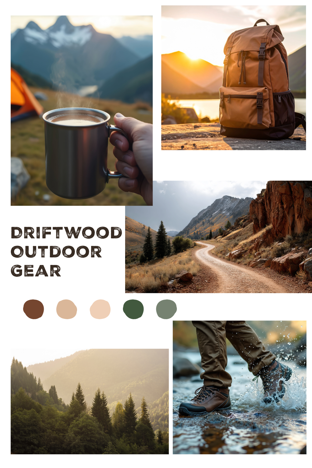
From there I built a mood board rooted in nature — mountains, forest textures, earthy tones — to lock in the rugged yet considered aesthetic before committing to any production work. This kept the client aligned early and meant fewer revisions later.
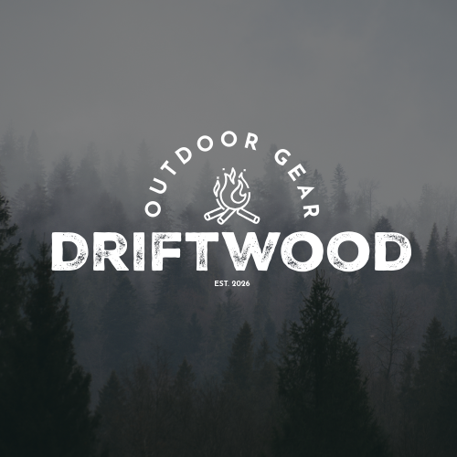
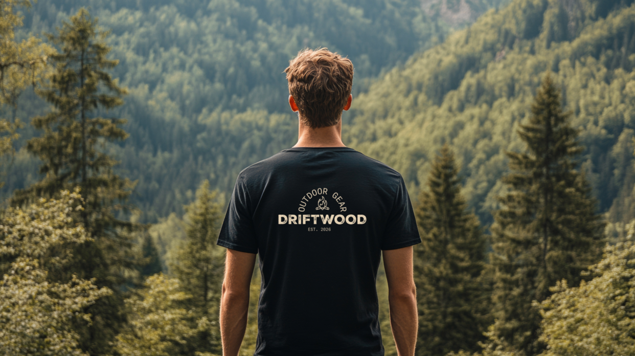
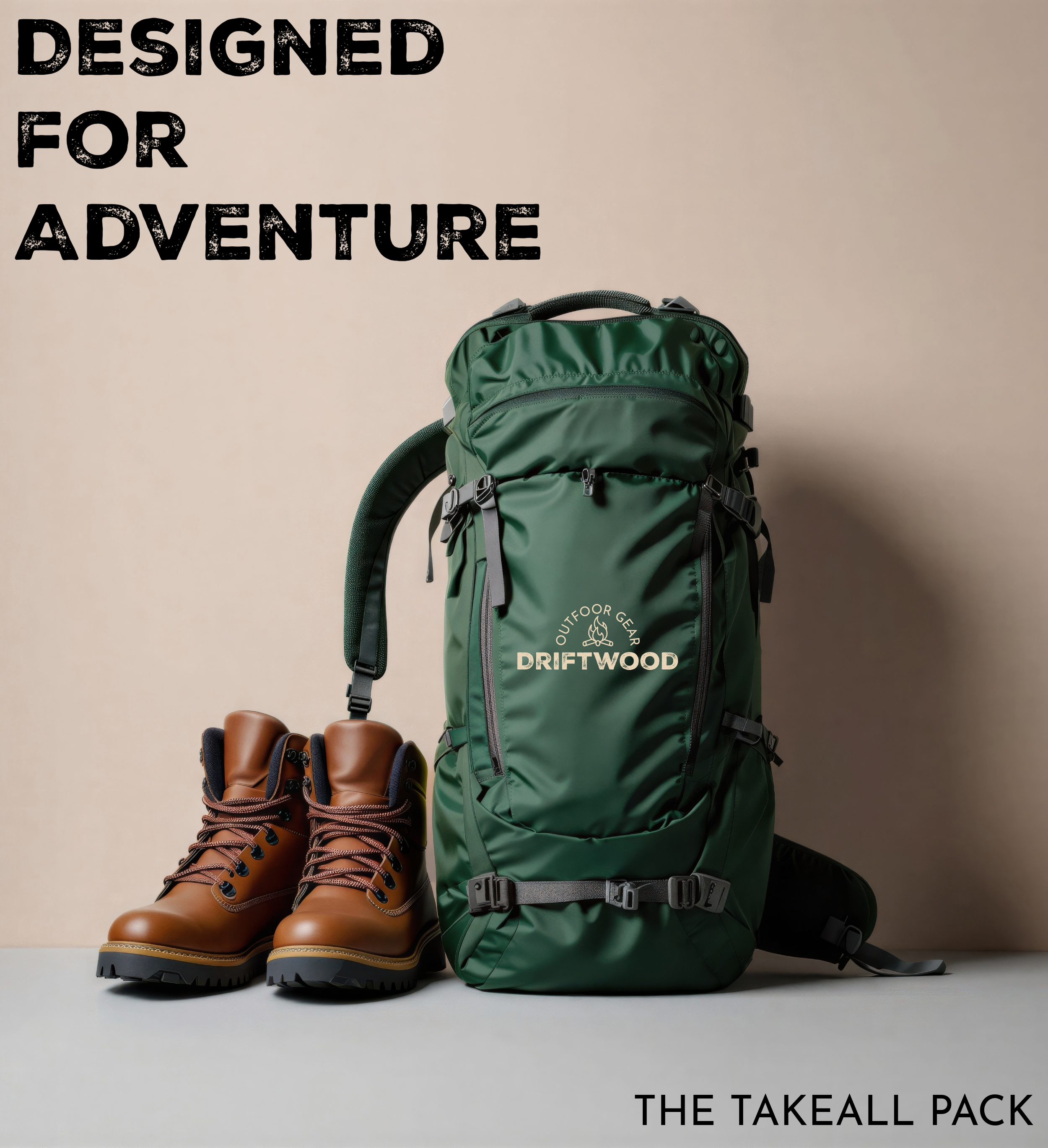
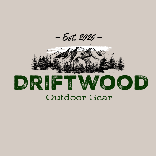
The design system came together around Nexa Rust Sans for headers (adventurous, approachable) and Josefin Sans as the secondary typeface, with a palette of Forest Green, Brown, and Accent Cream. Every choice was intentional — the palette had to feel timeless and distinctly outdoor without tipping into cliché.
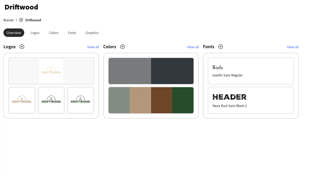
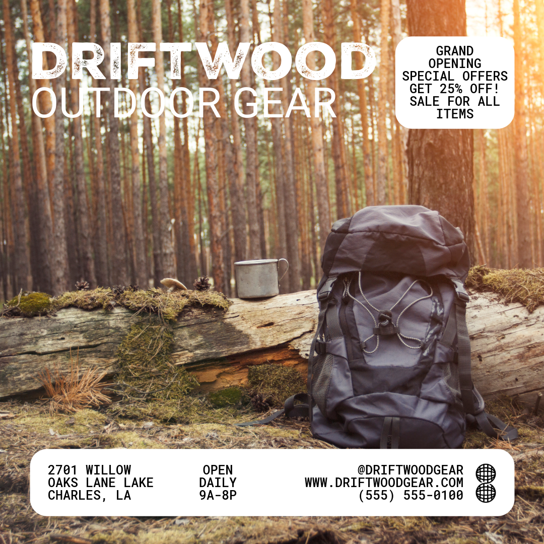
I designed reusable email templates in Figma for promotional, seasonal, and lifecycle flows, with grid systems and CTA placement baked in from the start. Alongside templates, I created branded graphic assets, edited photography to match the brand tone, and developed two logo variations at the client's request. An accessibility check ran before final delivery.
What Was Delivered
· Brand positioning statement and full creative brief
· Mood board and style exploration
· Complete design system: typography, color palette, grid
· Two logo variations
· Branded graphic assets for web and social
· Reusable email templates (promotional, seasonal, lifecycle)
· Brand guideline slide deck
· Organized final asset delivery with documentation
The Outcome
Driftwood received a complete visual identity system they can use consistently across every touchpoint. The reusable templates mean their team isn't starting from scratch every campaign , the system is built to scale with them.
Planning and Execution Phase
Planning
Project: Branding / Marketing Campaigns
Phase: Planning & Defining
Date: Mar 18, 2026
1. Design Concept
Concept Name: Rugged outdoor
Core Idea: Emphasize Driftwood’s eco-friendly, rugged outdoor lifestyle through earthy tones, bold typography, and nature-inspired visuals.
Objective: Create a cohesive visual identity for emails, graphics, and social campaigns that reflects authenticity, adventure, and environmental consciousness.
2. Design Attributes
Typography:
Headers: Bold, rustic sans-serif (rugged & adventurous feel)
Body: Classic serif (readable, professional, complements header style)
Imagery & Graphics:
Nature-inspired visuals (mountains, trees, forests, trails)
Lifestyle photography of outdoor adventures and gear in action
Subtle textures like wood grain, canvas, or stone for depth
Layout & Composition:
Balanced grid layouts for readability and visual impact
Emphasis on hero images and clear calls-to-action
Scannable sections to maintain engagement on email/mobile devices
3. Stylistic Techniques
Visual Hierarchy: Use bold headers and contrasting colors to guide attention
Brand Consistency: Consistent placement of logo, typography, and imagery style
Texture & Depth: Incorporate subtle natural textures to enhance rugged feel
Responsive Design: Ensure all emails and graphics adapt seamlessly across desktop and mobile
4. Color Palette & Text
Main Font: Nexa Rust Sans
Secondary: Josefin Sans
Primary Colors
Forest Green |. #2F4F2F. |. Headers, backgrounds, accents
Brown | #8B5E3C | Highlights, buttons, decorative elements
Accent Cream | #F5F0E1 | Backgrounds, text highlights, spacing
Execution
Step 1 – Mood Board & Style Exploration
Create mood boards with color palette, typography, textures, and imagery references
Gather inspiration from outdoor brands and Driftwood’s previous campaigns
Step 2 – Template & Layout Development
Design reusable email templates in Figma for campaigns (promotional, seasonal, lifecycle flows)
Define spacing, grid system, and CTA placement
Step 3 – Visual Asset Creation
Design graphics and hero images aligned with the rugged nature theme
Edit photography to match brand tone (color grading, filters, overlays)
Step 4 – Prototyping & Review
Build prototypes to test responsiveness and visual hierarchy
Internal review for brand consistency and accessibility
Step 5 – Client Feedback & Iteration
Present designs for client feedback
Incorporate revisions, maintain version control, and finalize assets
Step 6 – Final Delivery & Documentation
Export final assets in all required formats
Create a brand guide summary for email and campaign design
Deliver templates, graphics, and documentation for future campaigns
Success Metrics
Templates allow for efficient future campaign creation
Positive engagement metrics (open rate, CTR, conversions)
Client approval and satisfaction with brand representation
Mood Boards
Ran Accessibility Check
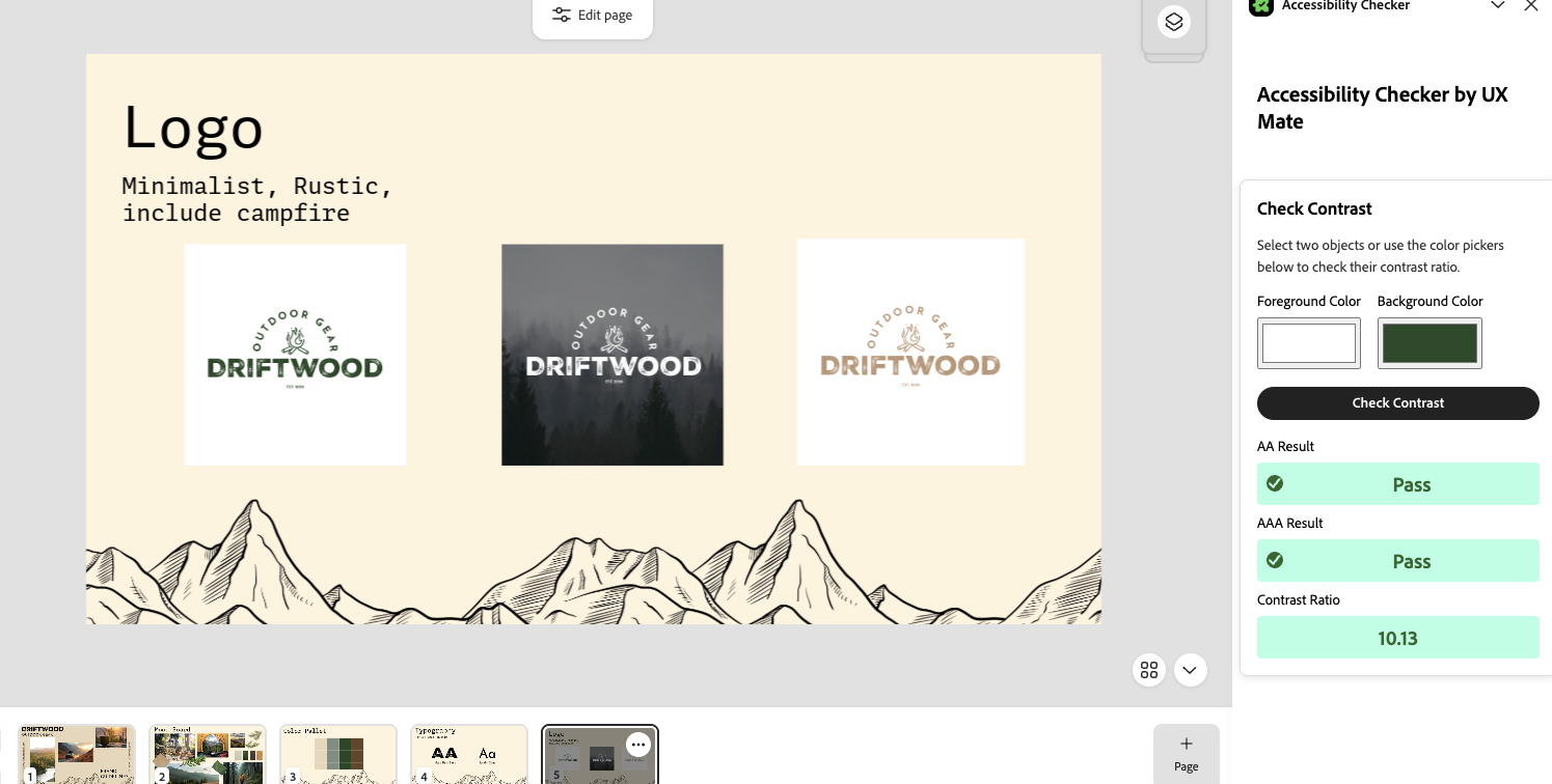
Logo Variations

(Two By Request)
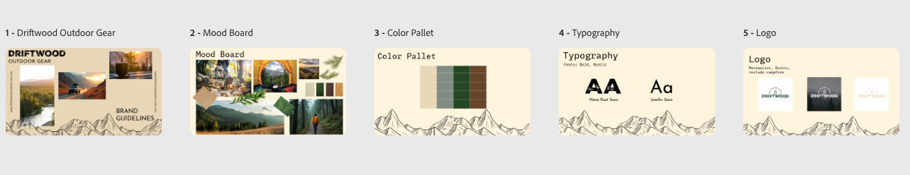
Brand Guideline Slide Deck
Designed Brand Kit