Artisan Crafts
UX Design Case Study — Academic Project
Role: Solo UX Designer
Tools: Figma, Competitive Audit, User Personas
Platform: Web (E-commerce)
Type: Academic Project
The Problem
Handmade goods have a trust problem online.
Eco-conscious shoppers increasingly want to support independent artisans — but when they land on an e-commerce site, they're met with the same experience as any mass-market retailer: product photos, a price, and a buy button. No story. No transparency about materials. No sense of the human behind the work.
That gap between what buyers need to feel confident and what most platforms provide leads to hesitation, abandoned carts, and a failure to connect products with the people who would love them most.
The core question: How do you design a marketplace that makes handmade feel handmade — even on a screen
The Core Insight
The barrier to purchase wasn't price or product selection.
It was trust. Specifically: trust in the artisan, trust in the materials, and trust that what arrives will match what was shown. Shoppers weren't asking for more products — they were asking for more transparency.
That insight reframed the entire design direction. This wasn't just an e-commerce UI problem. It was a storytelling problem.
Research & Discovery
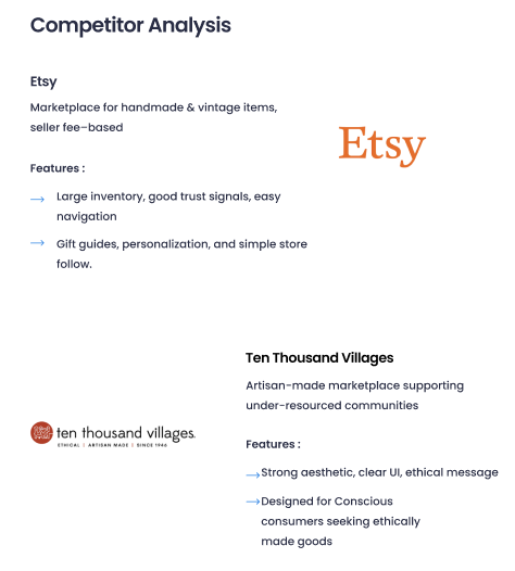
I started with a competitive audit of two established players in the space: Etsy and Ten Thousand Villages.
Etsy has scale but has drifted — the platform now surfaces mass-produced and drop-shipped goods alongside genuine handmade items, eroding the trust and authenticity that built its reputation. Ten Thousand Villages leads with mission and storytelling but the purchase experience feels dated and friction-heavy.
The gap both left open: a modern, trust-first shopping experience that puts the artisan at the center without sacrificing usability.
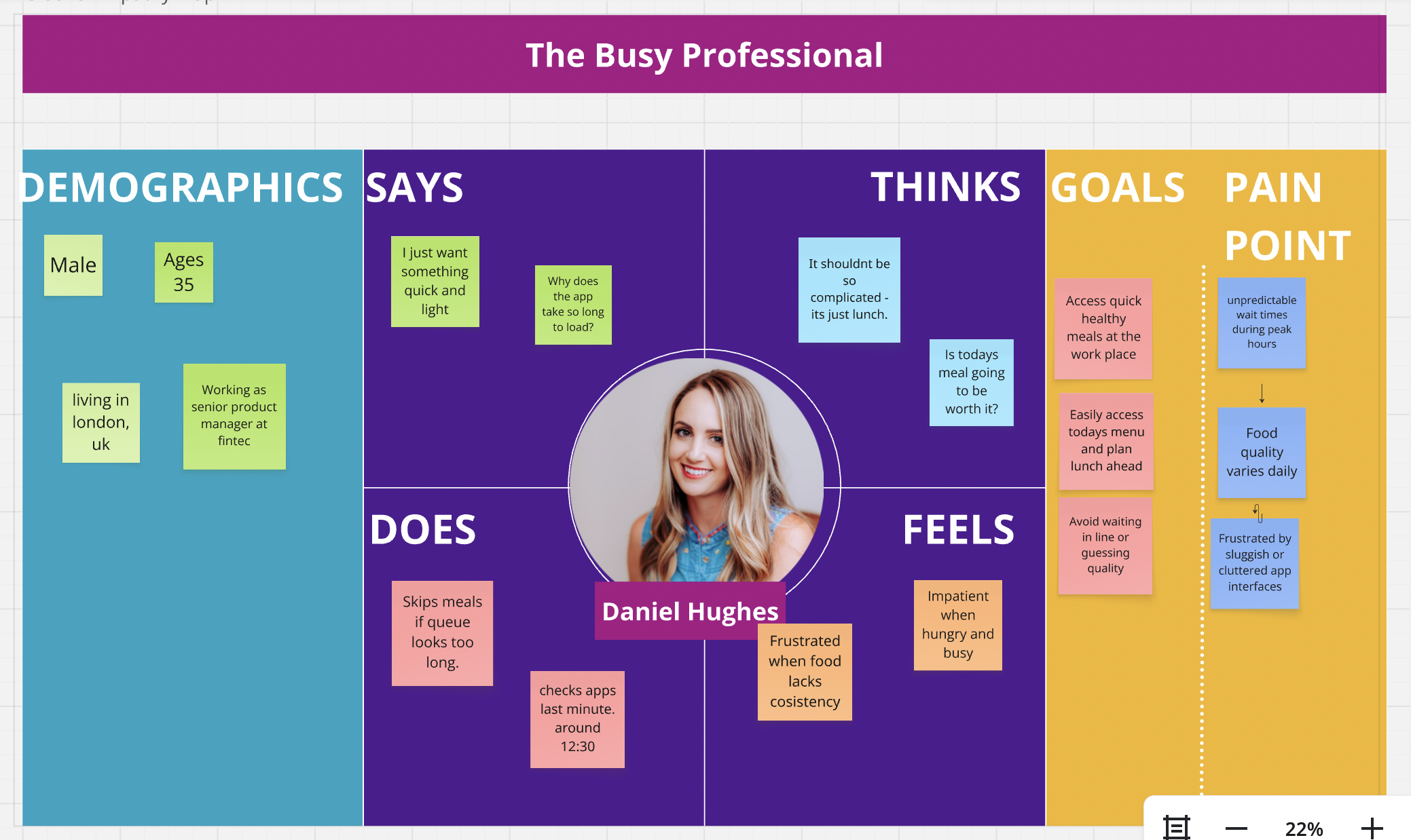
To understand the target user, I built personas through simulated research representing eco-conscious shoppers who:
Actively seek out independent makers over big retailers
Want to know what something is made from and how
Are willing to pay more — but need to feel the premium is justified
Hesitate to buy handmade online because they can't verify quality or authenticity
Design Approach
With trust as the north star, I focused the design on three pillars:
1. Artisan storytelling front and centerEvery product page leads with the maker - their process, their materials, their story. The goal was to make buyers feel like they're buying from someone, not from a platform.
2. Material transparencyClear, consistent labeling of materials, sourcing, and production methods throughout. Not buried in a tab - surfaced as part of the product narrative.
3. Friction-reducing trust signalsProminent shipping policies, clear return information, and authentic photography standards to reduce the uncertainty that causes hesitation right before checkout.
The Solution
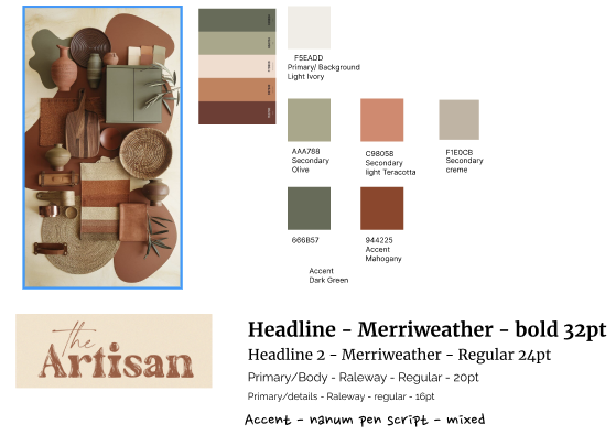
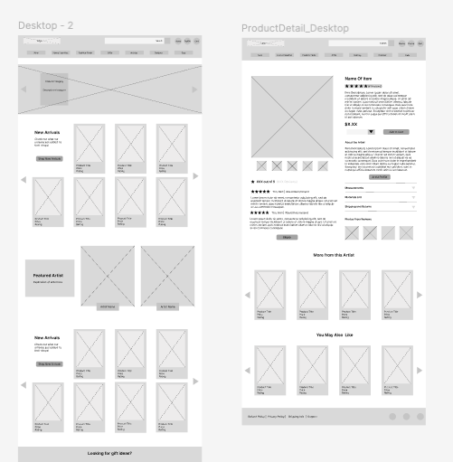
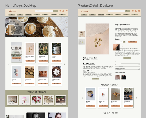
I designed a web experience in Figma built around these principles, including:
A homepage that leads with maker stories rather than product grids
Product detail pages structured as narratives: who made this → what it's made from → how it's made → how to get it
A consistent component library ensuring visual coherence across the marketplace
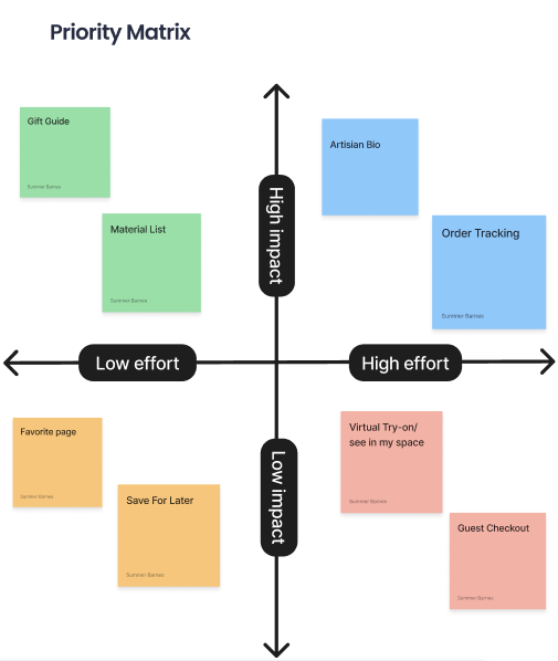
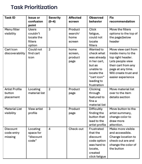
Wireframes and prototypes tested for usability across the core purchase flow
Reflection
What I'd do differently: The personas in this project were built through simulated rather than real user interviews. If I were to take this further, I'd validate the trust hierarchy - artisan story vs. material transparency vs. shipping clarity - through actual user testing to understand which signals move the needle most on purchase confidence.
What this project taught me: That the best e-commerce design isn't about making buying easier - it's about making trusting easier. Those are different problems, and they require different solutions.